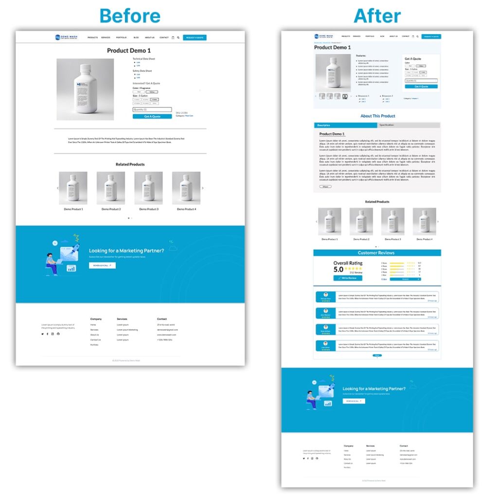
Confused about how often you should hit that refresh button on your website? Or maybe are you missing out on opportunities by sticking with the same design for too long?
These questions might sound familiar to anyone invested in their online presence. After all, your website is your digital storefront, the face of your brand in the virtual world.
But just like fashion trends or smartphone updates, websites need a makeover too. So, how often should you redesign your website to keep it relevant and effective?
As a thumb rule, a website must be redesigned every 2-3 years to keep up with every kind of update. However, this benchmark can vary depending on various factors, like industry, technology trends, audience preferences, and so on.
Read on to find out more!

So, Why You Need to Update Your Website’s Design?
First off, think about user experience. Just like you wouldn’t want to navigate a maze blindfolded, your visitors will certainly not want to struggle through a labyrinth of confusing menus and broken links.
As a result, updating your website’s design can streamline the user journey, making it easier for folks to find what they are looking for and keep them coming back for more.
Next up, let’s talk about first impressions. You know what they say – you never get a second chance to make a first impression. Your website is often the first point of contact between you and your audience, so you want it to shine brighter than a diamond in the rough.
A sleek, modern design can instantly captivate visitors and make them want to stick around to explore further.
But wait, there’s more!
Trends come and go quicker than you can say “update,” and if your website is still sporting last decade’s look, you might as well be wearing bell bottoms to a fashion show. Updating your design keeps your brand fresh and ensures you are not left in the dust while your competitors zoom ahead.
Last but certainly not least, there remains the trust. For instance, if your website looks like it’s been neglected since the dial-up days, visitors might question whether you are still in business or if you can deliver on your promises. A modern, professional design signals to your audience that you are on top of your game and ready to meet their needs.
Benchmark Your Current Performance Metrics
Benchmarking your current performance metrics is like giving yourself a health check-up for your business or project. You know how when you go to the doctor, they measure your vital signs to see how your body is doing?
Benchmarking does the same thing but for your organization’s performance.
Here’s the deal: benchmarking involves comparing your performance metrics against those of other similar entities in your industry. That is, it’s not about copying what others do, but rather about understanding where you stand in the grand scheme of things.
Now, why is this important?
Well, by benchmarking, you can figure out what you are doing well and what areas might need a little extra TLC. Maybe your customer satisfaction rates are through the roof, but your employee turnover is a bit higher than average. Knowing this lets you celebrate your wins and roll up your sleeves to tackle the areas that need improvement.
Plus, benchmarking isn’t just about looking at your competition. It’s also a chance to learn from the best in the game. You can identify industry leaders and see what they are doing differently. Who knows, you might come across a game-changing strategy or two!
![How Often Should You Redesign Your Website? [Top 8 Signs]](https://ba3digitalmarketing.com/wp-content/uploads/2024/04/How-Often-Should-You-Redesign-Your-Website-Top-8-Signs.webp)
How Often Should You Redesign Your Website? [Top 8 Signs]
Sometimes, even the coolest websites need a little facelift. Much like giving your online home a fresh coat of paint or rearranging the furniture to keep things exciting.
In general, the best is to opt for a website redesign every 2-3 years. However, this may greatly vary, depending on the latest trends, user experience, technology advancement, business goals, and growth.
So, how do you know when it’s time for that much-needed redesign?
Well, below is a list of the top eight signs that may suggest your website might be crying out for a makeover:
1. Slow Page Speed
Alright, picture this: you are trying to grab a quick snack from your favorite food joint, but there’s a line out the door.
Frustrating, right?
That’s what a slow page speed feels like for your website visitors. They are eager to dig into your content or products, but if your pages take ages to load, they might just bounce off faster than you can say “refresh.”
2. Boring Layouts
Ever stumbled upon a website that looked like it was designed in the early 2000s and felt like you were reading a textbook?
Believe it or not, that’s the last thing you would want for your site. Instead, your layout should be like a beautifully crafted stage setting, grabbing attention and keeping visitors hooked from start to finish.
We want to turn “boring” into “captivating” faster than you can say “wow!”
3. Cluttered Design or Difficult Readability
Suppose, you are walking into a room cluttered with stuff piled everywhere – you wouldn’t know where to start or where to find what you are looking for.
Your website shouldn’t feel like that!
We want visitors to glide through your content effortlessly, not squinting and scratching their heads trying to decipher what’s going on.
4. Missing a Clear Call to Action
Have you ever been in a situation where you are like, “Okay, what do I do now?”
Well, your website visitors shouldn’t feel that way.
They need clear signposts pointing them to the next step, whether it’s signing up for a newsletter, making a purchase, or simply exploring more of what you offer.
Time to make those calls to action pop like fireworks on a summer night.
5. Too Little Content
How will you feel if you are served a teeny-tiny appetizer when you were absolutely starving? That’s what too little content feels like on a website.
In other words, a website is like a gourmet meal – it needs to be satisfying, leaving visitors feeling full and content. But if you are serving up bite-sized snacks instead of hearty dishes, they will leave you hungry for more.
Let’s beef up that content and keep visitors coming back for more.

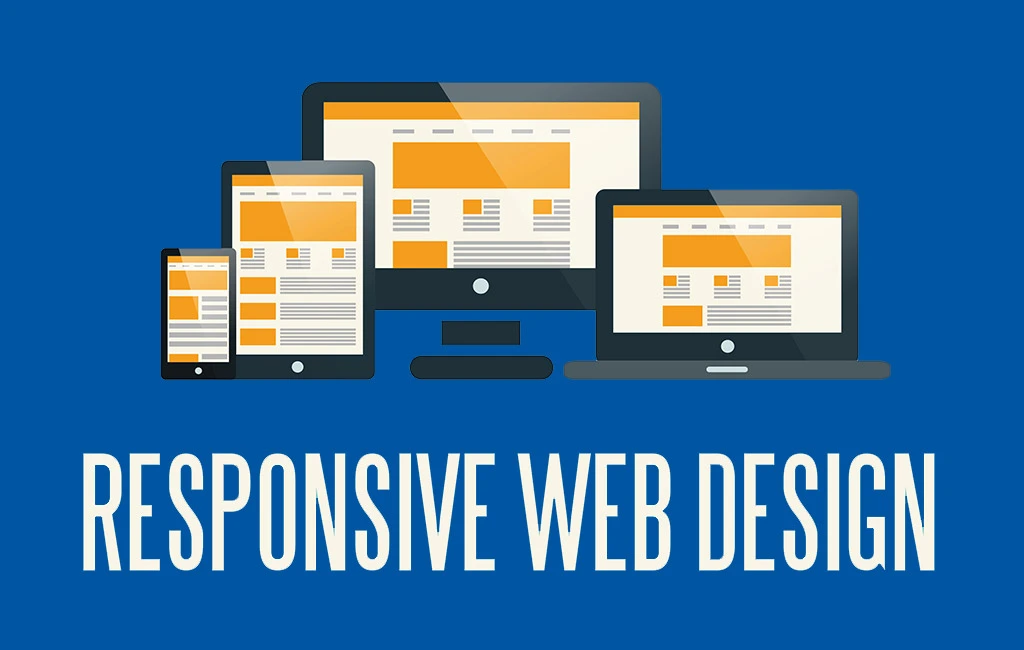
6. Design Isn’t Responsive Across Multiple Devices
In today’s world, people are browsing the web on everything from pocket-sized smartphones to massive desktop monitors. So, if your website looks great on one device but falls apart on another, you are missing out on a huge chunk of your audience.
Ultimately, meaning, it’s time to get responsive to make sure your website looks sleek and smooth, no matter the screen size.
7. Non-Intuitive Navigation
Do you feel like you are lost in a maze with no map?
Well, navigating a confusing website feels pretty similar. Visitors should be able to find what they are looking for with complete ease, like strolling through a well-marked park.
Let’s simplify that navigation so visitors feel like they are gliding through your site with a GPS guiding their way.
8. Dependence on Stock Imagery
Stock photos are like fast food – convenient, but lacking that homemade flavor.
That is, your website deserves imagery as unique and authentic as your brand. Hence, make sure to swap out those generic stock photos for images that capture the essence of who you are and what you do, like a photographer capturing the perfect sunset.
Avoid These Website Redesign Pitfalls
Redesigning a website is like giving your online presence a fresh coat of paint—it’s exciting, and full of potential, but also riddled with pitfalls you want to sidestep.
Here are some of the most common website redesign traps you will want to steer clear of:
Ignoring User Experience (UX)
How will you feel going to a fancy restaurant where the menu is in a foreign language and the waiter disappears every time you try to ask a question?
Frustrating, right?
The same goes for websites. Hence, keep your users at the heart of every design decision.
That is, make it easy for them to find what they are looking for and ensure a smooth journey from landing page to checkout.
The Temptation of Over-Designing
It’s easy to get carried away with the latest design trends and fancy features.
But remember, less is often more. Flashy animations and complicated layouts might seem cool, but if they are slowing down your site or overwhelming your visitors, they are doing more harm than good.
Keep it simple, snappy, and focused on what really matters.
Forgetting About Mobile Users
In today’s mobile-centric world, ignoring mobile optimization is a cardinal sin.
Your website needs to look and function flawlessly on all devices, whether it’s a desktop, smartphone, or tablet. Responsive design isn’t just a buzzword—it’s non-negotiable.
So, before you hit that redesign button, make sure your site is mobile-friendly.
Playing Hide and Seek With SEO
It’s easy to get lost in the maze of keywords, meta tags, and algorithms.
But here’s the thing—your website redesign shouldn’t sabotage your hard-earned SEO rankings. Make sure to carry over your SEO strategy to the new design, optimize your content, and keep those search engine gods happy.

Neglecting Load Speed
Time is money, especially in the digital realm. If your website takes ages to load, you are waving goodbye to potential visitors faster than you can say “buffering.”
Hence, optimize your site for speed during the redesign process. Compress images, minify code, leverage caching—do whatever it takes to keep things zippy.
Skipping the Testing Phase
Testing, testing, 1-2-3!
Don’t launch your redesign into the wild without putting it through its paces first. Get feedback from real users, run some A/B tests, and iron out any kinks before the big reveal.
Forgetting to Future-Proof
The internet is a fast-paced beast, and what’s cutting-edge today might be yesterday’s news tomorrow. Hence, when redesigning your website, always think ahead.
That is, invest in a platform that can adapt and grow alongside your business, saving you headaches down the line.
Wrapping Up
Well, there’s no one-size-fits-all answer to how often should you redesign your website.
Instead, it depends on various factors, including your industry, target audience, technological advancements, and your business goals.
But one thing is clear: treating your website as a static entity is a missed opportunity.
However, by staying informed, regularly assessing your website’s performance, and adapting to evolving trends, you can ensure your online presence remains vibrant and engaging.
So, whether it’s a subtle tweak or a major overhaul, remember that the key to success lies in finding the perfect balance between staying relevant and staying true to your brand identity.
FAQs
Like tidying up your room, you must keep your website fresh by editing it at least every few months. Tweak content, update images, and ensure everything is running smoothly.
Aim for a redesign every 2-3 years to keep up with trends and technology. In other words, give your site a new look and feel to stay ahead in the digital game.
Keep the content train rolling like a favorite TV show—consistently!
Add new content weekly or biweekly to keep visitors coming back for more. Fresh content boosts SEO, engages your audience, and shows you are active and relevant.


